Enterprise SaaS · Recruitment Platform · Pricing System

Flexible Budget

A large B2B recruitment platform sold everything in fixed packages - set units for job postings, CV database access, employer branding, ads. No matter what a client actually needed. The product team wanted to replace that with a flexible budget clients could spend over time.

Role
Expert Product Designer
Year
2026
Scope
Product Strategy · UX · Pricing Systems · AI Concepts
Industry
HR Tech / Enterprise SaaS
Confidentiality note. All company and product names are changed.
Fixed packages, wasted budget, painful renewals

Everything was sold in fixed packages. Clients got a set number of units for each product - job postings, CV database access, employer branding, ads - no matter what they actually needed. Salespeople spent hours building quotes, and at the end of the contract year, dealing with unused budget was painful for both clients and the finance team.

The product team had an idea: instead of packages, give clients a flexible budget they could spend over time. Better for clients, faster for sales, and a base for new business models. The problem was that making this work meant rebuilding the logic the whole system was built on.

I joined as the Product Designer responsible for the user experience of this change.

Not a pricing redesign - a complexity problem

Enterprise SaaS products carry years of business logic - product categories, budget rules, discount systems, offer types. The people using this - salespeople building quotes, clients picking products - needed to get through all that complexity without getting lost in it.

My main job was deciding what to show users, what to hide, and how to guide them so that setting up an offer didn't feel like memorizing a rulebook. It wasn't about making things look nicer. It was about making a complicated system actually usable.
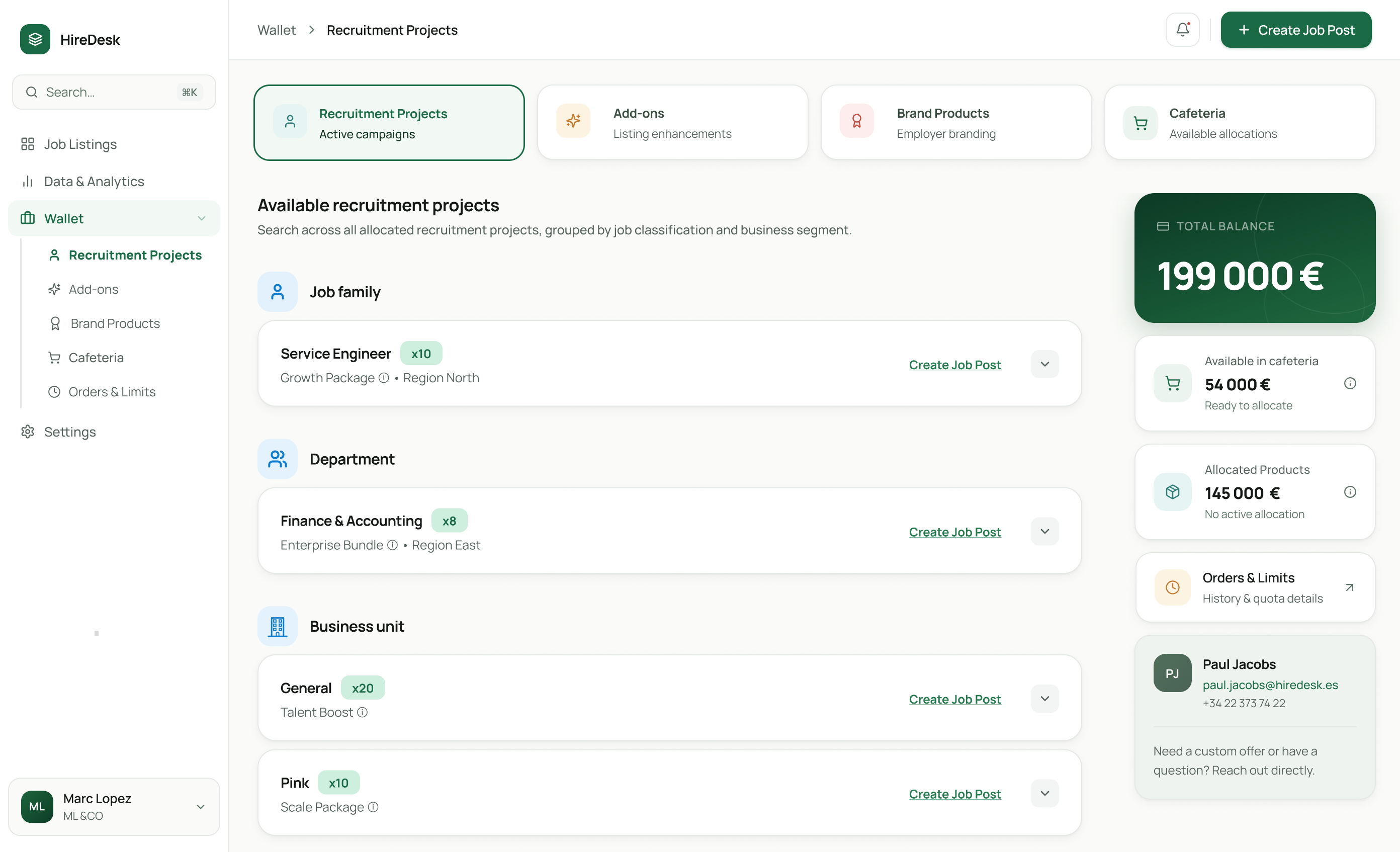
Recruitment Projects - wallet and budget overview
The budget usage zone - available recruitment projects grouped by job family, department, and business unit
Two budget models, two different experiences

Financially, both work from the same pool of money. But as user experiences, they're very different - and both had to work in the same system, used by the same salespeople and the same clients.
Model 01
Hard Allocation
Closer to the old model: the budget turns into specific products assigned upfront. The client knows what they have, the salesperson knows what they sold. The UX challenge was showing that these decisions were fixed without making users feel like they had no control.
Model 02
Product Cafeteria
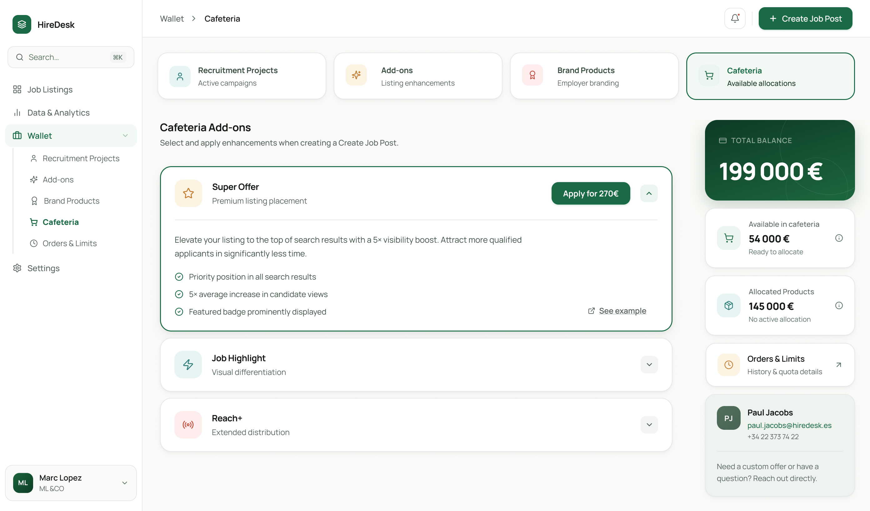
Flips that around: the budget comes first, and clients pick products from it over time, when they need them. The challenge was giving users real freedom without overwhelming them with choices - and always showing how much budget is left, what it can buy, and what can still be changed.
Cafeteria Add-ons - clients pick products from their remaining budget
The Cafeteria view - remaining budget, allocated products, and add-ons a client can apply directly to a job post
Three areas of the system
01
Budget usage zone
The place in the ATS where clients see their budget, track how they're using it, and make product decisions. The heart of the new experience - if this view didn't make sense on its own, the rest of the product would fall apart with it.
02
Job posting creator
The flow users go through every time they want to publish a job ad. The new budget model had to fit into this without making the process longer or more confusing than it already was.
03
Cooperation Proposal
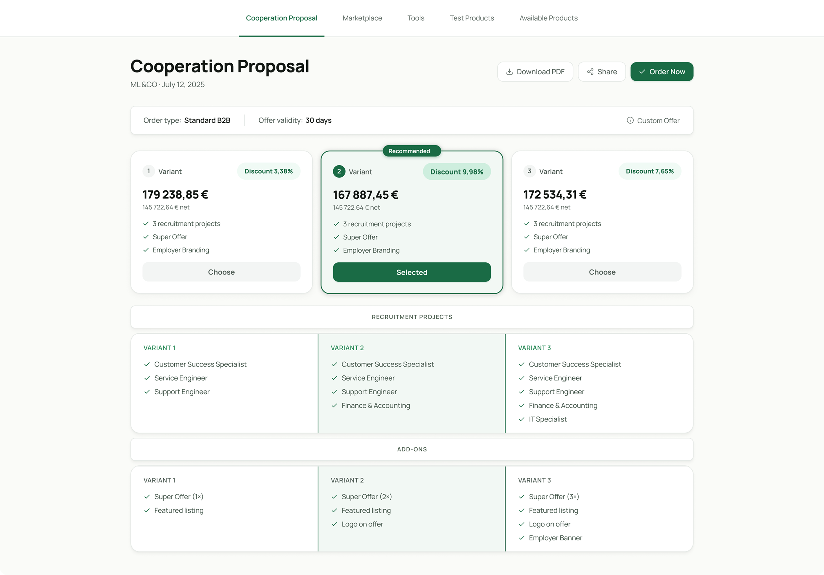
The document a client gets from their salesperson. It had to clearly show multiple offer variants, discounts, terms, and recommendations in a way that didn't need a phone call to explain.
Cooperation Proposal - three offer variants with discounts and recommendations
The Cooperation Proposal - three variants side by side, one flagged as recommended, with product breakdowns per variant
From sales opportunity to a live job post

A new sales opportunity moves through Salesforce into the offer creator, where a salesperson chooses the allocation type - fixed, a mix, or full cafeteria - before the offer is generated and the budget is deployed into the client's portal. Three very different allocation paths had to converge back into one consistent offer document and one consistent client experience.

End-to-end pricing flow diagram
End-to-end flow
Designing what doesn't exist yet

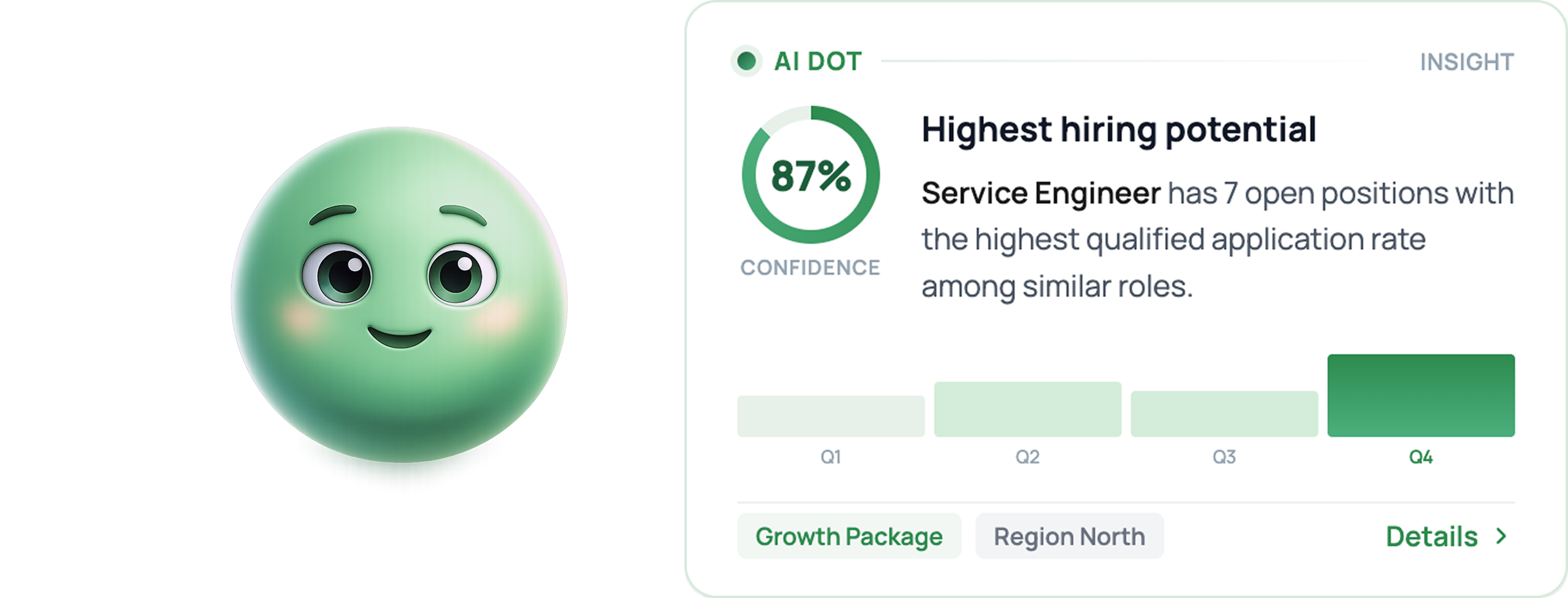
Alongside the main work, I also designed a concept for AI Dot, an assistant made possible by the flexible budget model. It was a future concept - my job was to figure out how it would look, where it would appear, and how it would fit into existing flows without breaking them.
Concept
AI Dot
An assistant that suggests how to use the budget based on a client's recruitment history and goals - a natural extension of the Product Cafeteria model, surfacing the next best purchase instead of leaving clients to browse alone.
AI Dot - insight card showing highest hiring potential
01 · Speed
AI-assisted design
Instead of the usual wireframe → prototype → handoff process, I used AI tools - Claude Design, Figma Make, Figma AI - to get to high-quality visuals faster and test solutions in something close to the real product.
02 · Alignment
Decisions made together
Key UX decisions were made together with Product Owners, the sales team, and developers - not handed down from a design file.
03 · Validation
Checked against reality
Sales checked that the flows made sense in real conversations with clients, and prototype tests with recruiters validated the trickiest UX calls before anything moved to build. Developers confirmed what was technically possible.
3 → 1
Allocation paths unified into one consistent offer flow
2
Budget models validated and shipped side by side
Consistent
Interface patterns reused across the whole platform
Foundation
Set up for new sales models and AI features